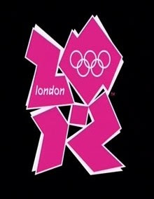
 THE dramatic new logo for the 2012 Olympics was unveiled today - in a series of very bright shades of pink, blue, green and orange as a modern take on the Olympic colours.
“It has a movement to it and it will evolve and change,” a London 2012 spokeswoman said of the jagged emblem, which is based on the digits 2012. The word “London” and the all-important Olympic rings are included in the first two digits.
Organisers hope the brand, which must be immediately recognisable worldwide, will boost its marketing push to raise £2 billion to stage the Games and its ambition that London 2012 will be “Everyone’s Games”.
Personally, I think it's ugly.
2 comments:
I'm not too impressed with the logo either. :(
Good job there's 5 years in which to change the damn ugly thing!
Post a Comment